
Internal draft. Do not publish.
Business cards remain useful for Rochester businesses. They support networking, sales meetings, referrals, community events, and customer follow-up.
A well-designed card should be easy to read, accurate, durable, and consistent with your brand. Avoid these seven common mistakes before ordering business card printing in Rochester NY.
1. Using hard-to-read typography
Typography affects how quickly people understand your card.
Small text, decorative fonts, weak contrast, and inconsistent typefaces can make important information difficult to read. This is especially important when someone views your card briefly at a meeting or event.
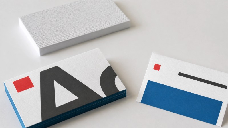
Common problems include:
- Contact information below a readable size
- Script fonts used for phone numbers or email addresses
- More than two or three typefaces
- Similar colors used for text and background
- Uneven spacing between lines
- Capital letters used for every word
Use simple typefaces for names, job titles, phone numbers, email addresses, and websites. Sans-serif fonts often provide clear results at small sizes. A decorative font can work for a logo or name, but it should not reduce readability.
Use a clear hierarchy:
- Name
- Job title
- Company name
- Phone number and email
- Website or call to action
Review the design at 100 percent before sending it to print. Text that appears readable when enlarged may be too small on the finished card.
2. Listing weak or outdated contact information
A business card has one primary purpose. It gives people a reliable way to contact you.
Do not include every possible detail. Too much information can make the card difficult to scan. However, leaving out basic information creates a different problem.
Include:
- Full name
- Job title or service role
- Company name
- Primary phone number
- Professional email address
- Website or social media link
- Business address when relevant
Check every detail before approving the final file. Confirm phone numbers, email addresses, website URLs, job titles, office locations, and social media handles.
Remove information that no longer applies. This includes:
- Old phone numbers
- Former addresses
- Outdated logos
- Former job titles
- Inactive social media accounts
- Personal contact information that should not be public
Use one primary phone number and one primary email address when possible. If your business serves customers at a physical location, include the address or a QR code that directs customers to accurate directions.
A QR code can support a website, booking page, menu, portfolio, or online profile. Test it with more than one phone before printing.
3. Using a low-resolution logo
A logo must reproduce clearly at a small size. A low-resolution file may look acceptable on a computer screen but appear blurry or pixelated in print.
The best file types are usually vector formats, such as AI, EPS, or a vector PDF. These files can scale without losing sharpness. If a raster image is required, use a high-resolution file prepared for print.
General file requirements include:
- Images set at approximately 300 DPI
- Correct card dimensions
- Proper bleed when artwork reaches the edge
- Safe margins for text and logos
- CMYK color settings when required by the printer
- Fonts embedded or outlined in the final PDF
Do not copy a logo from a website or social media profile. Those files are often too small for print. Ask your designer or branding provider for the original logo package.
Keep the logo consistent across your business cards, envelopes, letterheads, flyers, catalogs, and other materials. Consistent colors and spacing make your business easier to recognize.
Image Printers provides business card design, layout, and printing services. You can also coordinate business cards with stationery and other printed materials.
4. Ignoring print specifications
A strong design can still produce poor results if the file is not prepared for printing.
Common technical errors include:
- Missing bleed
- Text placed too close to the trim line
- Low-resolution images
- Incorrect card size
- RGB artwork that shifts color during production
- Unchecked spelling errors
- Misaligned front and back designs
- Transparent effects that do not export correctly
Ask for the printer’s file specifications before designing the card. Use the correct template and keep essential information inside the safe area.
If the design has a background color, photo, or pattern that extends to the edge, the artwork must usually extend beyond the trim line. This extra area is called bleed. It helps prevent a thin white edge caused by minor cutting variation.
Review the proof carefully. Check:
- Spelling
- Numbers
- Alignment
- Color
- Logo placement
- Front-to-back orientation
- QR code function
- Trim and bleed
The proof approval stage is the last opportunity to correct the file before production. Do not approve a design without reviewing all details.
5. Overcrowding the layout
A standard business card provides limited space. It cannot function as a complete brochure.
Trying to list every service, award, certification, social account, slogan, and promotional message can create a cluttered layout. It also makes the primary contact information harder to find.
Start with one purpose. The card may be intended to:
- Generate calls
- Direct customers to a website
- Support referrals
- Promote a specific service
- Provide contact details after a meeting
Keep only the content that supports that purpose.
Use white space to separate the logo, name, contact information, and call to action. White space is not wasted space. It improves scanning and gives the design structure.
A two-sided card can provide more flexibility. Use the front for the core identity and contact details. Use the back for a short service list, QR code, appointment instructions, or brand message.
Keep service lists short. For example:
Business cards, flyers, catalogs, stationery, loyalty cards, coupon cards, and more
Do not reduce the font size simply to fit more content. Remove unnecessary content first.

6. Choosing the wrong paper stock
Paper affects how a business card looks, feels, and performs.
Thin stock may bend easily in a wallet, pocket, bag, or display holder. A heavy coated stock may not suit a business that needs to write notes on the back. A glossy finish may improve color but create glare when someone tries to read it.
Consider the following factors:
- Brand style
- Intended use
- Writing requirements
- Color coverage
- Durability
- Budget
- Matching stationery
- Available printing and finishing options
Common choices include matte, gloss, coated, uncoated, and textured stocks. Professional services may prefer a clean matte or uncoated appearance. Businesses using photography or strong color may prefer a coated finish.
Ask to review paper samples when available. A physical sample provides a better understanding of thickness, texture, color, and finish than a screen image.

Paper should also match other printed materials. If your business uses matching envelopes, letterheads, folders, or flyers, coordinate the stock and finish when practical.
Image Printers offers printing and copying services, including color copies, black and white copies, bulk copying, fax services, printing services, and more.
7. Omitting a clear next step
A business card should tell people what to do next.
The next step may be a phone call, website visit, consultation request, appointment, online order, or social media connection. A short call to action can make this clearer.
Examples include:
- Call for an estimate
- Schedule a consultation
- Visit our website
- Scan to view our portfolio
- Book an appointment
- Request a quote
Use one primary call to action. Multiple competing instructions can create confusion.
The call to action should match the purpose of the card. A contractor may direct customers to request an estimate. A restaurant may use a QR code for a menu. A consultant may direct prospects to a booking page.
Keep the call to action short and make the link easy to access. Test every QR code and URL before approving the card.
Business Card Printing Checklist
Review this checklist before ordering:
- Is the text easy to read?
- Are all contact details current?
- Is the logo high resolution?
- Are colors consistent with the brand?
- Is the file prepared for print?
- Are bleed and safe margins correct?
- Is the layout uncluttered?
- Is the paper appropriate for the intended use?
- Does the card include one clear next step?
- Has the final proof been checked at 100 percent?
Business Card Design & Printing in Rochester NY
Local businesses can manage the process themselves when they have a finished design and correct print files. Design support is useful when the logo needs improvement, the layout is crowded, or the card must match existing marketing materials.
Image Printers M&P Corp. has served the Rochester area since 1989. Services include business card design, business card layout, black and white printing, full-color printing, graphic design, stationery, flyers, catalogs, invitations, and more.
The company provides design and printing under one roof. Businesses can request a quote, upload an existing file, or contact Image Printers at 585-360-0132.
Before starting business card printing in Rochester NY, prepare your current logo, contact information, preferred paper, quantity, and intended use. This will help reduce revisions and support a more accurate quote.